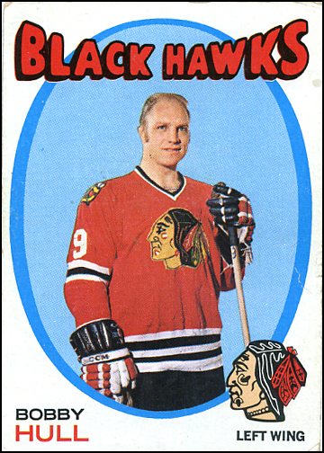
Topps released its 2014 Baseball Archives set this week, and usually I don’t pay attention to baseball cards. But Topps did something with this set that really annoyed me: they used a classic hockey card design in the new Archives baseball set — specifically, this design:

Yes, that is the classic 1971-72 Topps and O-Pee-Chee design, re-purposed for a 20-card insert set of baseball cards — cheapening it in the process.
Everyone who reads this blog knows how much I love the 1971-72 design. It is the best hockey card design from the 1970s. (If you don’t believe me, read this first and then we’ll talk.)

Using this design for a baseball set would be like putting Sidney Crosby on a 1952 Topps Baseball card, or Alex Ovechkin on a 1989-90 Hoops Basketball card.
Inconceivable!
Five years ago, In The Game created a set of trading cards called 1972: The Year In Hockey which was reminiscent of the 1971-72 Topps/OPC design. I don’t know the full story, but I understand that In The Game got into a legal entanglement with Topps for making cards that also used ovals, bright colors and puffy letters. As if Topps invented — or outright owns — any of those design elements.

The 1972 set by In The Game was a hit with old school collectors who either bought cards in 1971-72 (that was before I was born), or collected that set later on. Making a new hockey set look like an old hockey set makes sense — especially when done right.
Anyway, would the type of collector who buys Topps Archives Baseball cards really give a damn about baseball cards that look like old hockey cards? I think they’d be more excited about new baseball cards that look like old baseball cards. Or the insert cards based on the Major League movie. I’m not even a baseball fan and I want those cards!

But these cards…irritate me.
Frankly, I”m tired of card companies re-using old designs because they don’t even do it right anymore.Think about Upper Deck’s half-hearted release of Fleer Retro last year. Some of the “retro” cards were great, but many of the inserts were dumb because they weren’t even based on hockey designs, like Intimidation Nation (based on a football set) and the God-awful Noyz Boyz (based on basketball cards).
Yes, Topps made hockey cards in 1971-72, and can use that design all they want. They can use it on baseball cards or FIFA World Cup cards or Spongebob Squarepants cards or whatever the heck they make these days.
But just because they CAN doesn’t mean they SHOULD.


Yes, I was ripped off before with a design I made for pacific dynagon in the 90’s when they came out. They built their reputation by stealing.
Hi Brad,
Thanks for the comment. Please elaborate: who ripped off your design? What year was the set you designed? And what company ripped off your design? I’d love to know more.
Sal
Come on now, they aren’t that bad? It could be worse. Someone could make a hockey set out of 1987 Topps baseball. That would be bad.
Its sort of interesting and neat to see them take from a hockey design. Sort of legitimizes the 71/72 set as being on par with the best card sets ever made.
Still it is just too strange for me and probably not something I would be interested in getting. That said, I imagine that most baseball collectors or at least the average one, will think nothing of it as I suspect they have little to no knowledge of hockey cards, much less the 71/72 set these are based on.