

With 2024 coming to a close, it was now or never for announcing the Puck Junk Bad Hockey Card Hall of Fame: Class of 2024. But there’s nothing quite like a deadline to get things done, right?
This year’s Hall of Fame class sees three new members added to the Bad Paint Job Category, four new members enshrined in the Bad Photograph Category, two new members honored in the Bad Idea Category, and – for the first time since 2021 – a new addition in the Bad Mascot Category.
The Bad Paint Job Category
Finding poorly repainted cards in hockey sets from the 1970s and 1980s is too easy. Just look at any Topps or O-Pee-Chee set from that era, and you will lose count of all the cards with altered photos. So, in order to be counted for the Bad Hockey Card Hall of Fame, these alterations need to be extra awful.
1975-76 Topps #177: Dan Maloney

Is it a hockey card from the 1970s – or a painting by impressionist artist Claude Monet? It’s hard to tell, considering that everything except Maloney’s face has been painted over. When Maloney was traded from the Kings to the Red Wings, Topps repainted Maloney’s uniform red, but then painted the ice blue (for some reason), and the boards white. I can look past the janky Red Wings logo, or that Maloney appears to be skating on water, but clean boards without any puck marks is just too unrealistic. (First mentioned on Puck Junk – in the comments – in 2020.)
1982-83 O-Pee-Chee #115: Ken Linseman
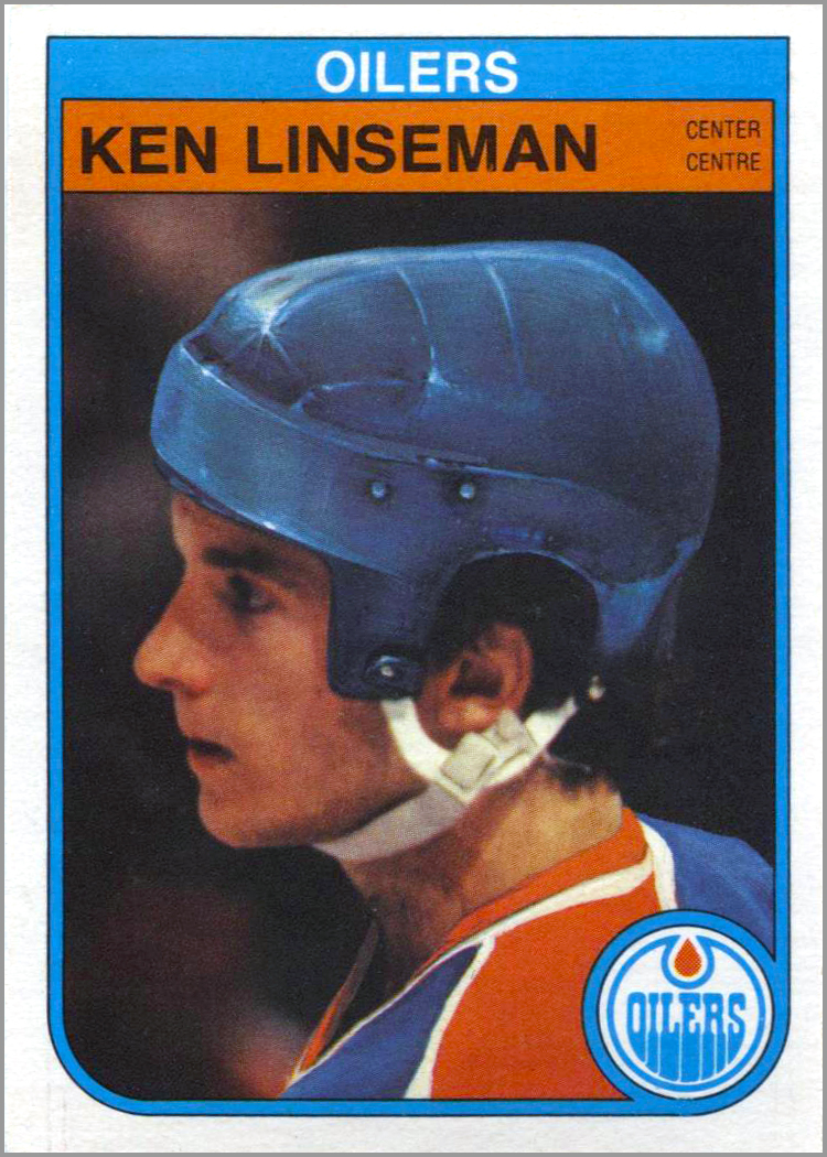
Ken Linseman was traded from the Philadelphia Flyers to the Hartford Whalers, then from the Whalers to the Edmonton Oilers one day in August of 1982. O-Pee-Chee got to work and repainted Linseman’s hockey card photo – adding what appears to be electrical pulses on his helmet.
I think the “artist” who altered Linseman’s photo was drawing inspiration from one of those electrical orb lamps you find at The Sharper Image…

…or the good guy from the movie TRON – which came out the month before Linseman was traded.
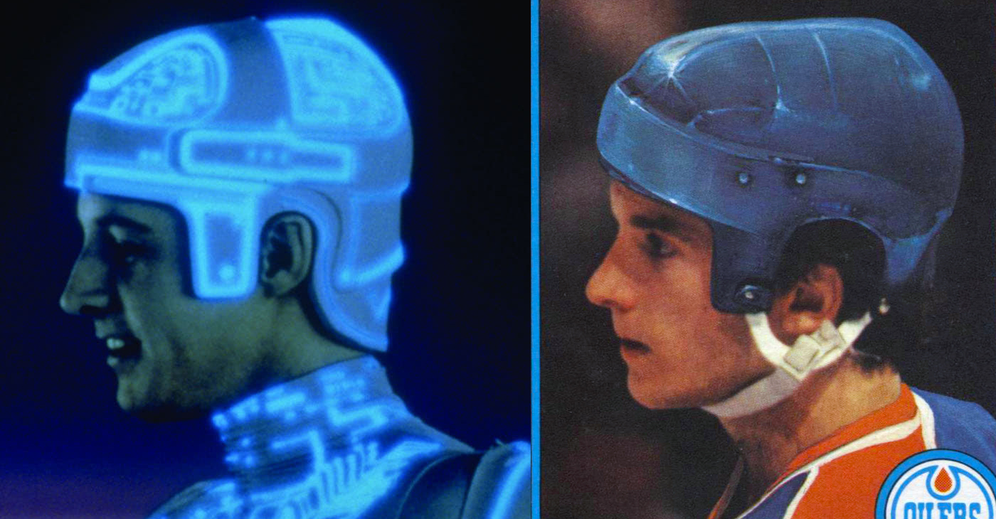
Coincidence? I think not!
1987-88 O-Pee-Chee #245: Dale Hunter
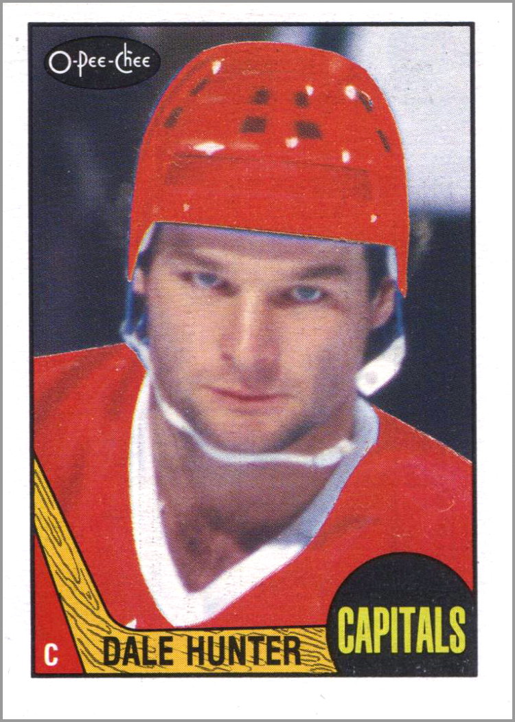
Over the summer of 1987, Dale Hunter was traded from the Quebec Nordiques to the Washington Capitals – and the O-Pee-Chee artists did their usual subpar job when converting Hunter from a Nord to a Cap. Hunter looks more like a member of the Soviet Red Army team than the Capitals. Notice they didn’t add the white shoulder yoke on his jersey, nor did they cover all of the blue in Hunter’s Nordiques helmet. And they forgot to add the devil horns and pitchfork too. If you ever saw Hunter play, you would agree. (First mentioned on Puck Junk in 2008.)

The Bad Photograph Category
A picture is worth 1,000 words, but the pictures used on these cards are worth 1,000 laughs.
1995-96 Upper Deck #167: David Oliver

David Oliver, who finished third in scoring among rookies the previous season, is pictured here putting one in the net. Only, it isn’t the puck that he’s putting on goal, but himself. Remember, a photo editor at Upper Deck, living the dream in the mid-1990s, decided that THIS picture of Oliver, falling backwards into the net, was exactly the photo that card collectors wanted. Obviously, Upper Deck didn’t learn that a guy falling down on his own card – such as Denis Potvin in 1981-82 or Rob Blake in 1991-92 – is never a good look. (Shout out to Devin Boop for the nomination.)
1971-72 O-Pee-Chee #231: Dennis Kearns

If anyone needed to be “head swapped” onto a different player’s body, it is poor lil’ Dennis Kearns, who can’t even fill the front of a hockey card. Kearns looks more like a Hobbit trying to stop Sauron than an NHL defenseman trying to stop Bobby Hull. Even though he is listed at 5-foot-8, Kearns appears just a bit too short to ride the rollercoaster without a parent – or to be on his own hockey card, for that matter. (First mentioned on Puck Junk – in the comments – in 2017).
1993-94 EA Sports #198: Crowd Records

When Electronic Arts released the excellent video game of NHL ’94 in the fall of 1993, the company also offered a set of cards that could be purchased through the mail. The NHL ’94 Game Card Set included cards of the league’s best players, tips on how to play the game better, and cards that touted some of NHL ’94‘s new features and upgrades – such as “Crowd Records,” arguably the most-useless hockey card ever. The back of the card explained that the louder the crowd gets, the better the team plays. So naturally, the front of the card shows a bunch of bored hockey fans. You have (from left) a man yawning, a man scratching his face, a man about to sneeze, and a man who is either pouting or is cold. I guess the record this crowd is setting is for most unexcited fans at a game. (First mentioned on Puck Junk in 2024.)

1975-76 O-Pee-Chee WHA #64: Andre Lacroix 1st Team All-Star

Look at this card and ask yourself: who is the real all-star? Is it Andre Lacroix, who scored 147 points in 78 games the previous year? Or is it the linesman’s ass, which is front and center here? Lacroix looks indignant that he’s taking a backseat to the linesman’s backside – ON HIS OWN HOCKEY CARD!
Even worse, the picture was used on BOTH of Lacroix’s cards in that set.

Related: The Puck Junk Bad Hockey Card Hall of Fame Class of 2017, 2018, 2019, 2020, 2021, 2022., and 2023.
The Bad Idea Category
The Bad Idea Category highlights hockey cards that are so bad that they should have never been made. But for some crazy reason, they were. This year, a card from three decades ago rightfully gets inducted, along with a superbad card of a current superstar.
1994-95 Kraft – Masked Defenders: Daren Puppa, a.k.a. “Poops”

About 90% of hockey nicknames are terribly uncreative. Just take the player’s first or last name, shorten it if necessary, and finally add “ER,” “IE,” or “S” to the end of it. The 1994-95 Kraft cards spotlighted 26 goalies, adding their nicknames to the design. Sure, some goalies had great nicknames that didn’t conform to the standard, such as Eddie “The Eagle” Belfour. But we also learn some of the less-than-stellar nicknames, like Andy Moog is “Mooger,” Sean Burke is “Burkie,” and Darren Puppa is “Poops.”
Yes, Poops. Keep in mind that these oversized cards were printed on boxes of Kraft Dinners sold throughout Canada during the season. So maybe “Poops” could be misinterpreted as a warning of what eating too many Kraft Dinners will give you – and I don’t mean free hockey cards. Yet, as embarrassing as it sounds, “Poops” is still a better nickname than “Pooper” or “Poopie.”
2021-22 Allure – 16-Bit #B-10: Sidney Crosby

I love classic video games and thought that video-game styled portraits of NHL players were a great idea. Well, the idea was great…but not the execution. Poor Sidney Crosby looks like he’s caught between a laugh and a sneeze.
Sid the Kid resembles the love child of the Annoying Orange…

…and the Agatha Harkness Winking meme.

Then again, a 16-Bit Sid recently sold on eBay for $785.00 CDN ($546.70 USD). That makes this the most-expensive card in the Bad Hockey Card Hall of Fame by about $800.

The Bad Mascot Category
Most mascots are just dumb, fuzzy animals – or whatever the hell Buoy is – wearing sports jerseys. Lame! But to make the Bad Hockey Card Hall of Fame, the mascot has to somehow look even worse on their own card than in real life. This year, one mascot gets the call to the Hall.
1997-98 Louisiana IceGators: Alphonse the Alligator

Alphonse the Alligator doesn’t really look like an alligator on his card. He looks more like a coked-up t-rex…which explains his wide-open eyes and the white powder all over his face. I get that a team called the IceGators would have an alligator as a mascot – but this one looks like Barney the Dinosaur on drugs.

Just remember kids – hugs, not drugs.
Which of these cards do you think is the worst of them all? And what card do you think should make it into the Puck Junk Bad Hockey Card Hall of Fame in 2025? Leave a comment and let me know!
Love hockey? Join the Puck Junk Facebook Group, listen to the Podcast, subscribe to the Newsletter and YouTube Channel, and support this site at the Online Shop.
Follow Sal Barry on Bluesky @PuckJunk and on X/Twitter @PuckJunk. ■


The GOAT is the Espo Wearing Slacks card.
Haha, yeah…that one is terrible! And it was re-used in like a dozen cards over the next few years.
The 2002/03 Fleer Throwbacks card # 35 shows the Dan Maloney Kings photo that was used on the 75/76 card. Almost 30 years between using the same image.
OMG! Al – you are a legend! Thank you for letting us know.
The 75-76 OPC WHA set is one of the best 1970’s hockey card sets produced (in my opinion). I find it hard to agree with the Andre Lacroix choice. He was a great player in the WHA, and only once finished with less than 100-points in a season during his time in the league. Truly an All-Star in every sense.
PS – The Tron helmet reference was pretty funny for Kenny Linseman, another former WHA’er himself.
Hi Rob – thanks for reading! I agree that the 1975-76 OPC WHA set is great (I still need to get one for my collection). And I agree that Lacroix had a stellar career. My problem is with the photo that they selected to use on both of his cards, which I think is a bad photo…hence it’s inclusion in this year’s BHC HOF 🙂