A mediocre set for a mediocre team
 Before the Sharks took up residency in San Jose, there was another team by the same name. The Los Angeles Sharks – no relation to the current team in San Jose – was a founding member of the World Hockey Association (WHA). Unlike some of the luckier teams in the WHA who had the benefit of a Bobby Hull or Gordie Howe playing for them, the Sharks did not have much in the way of star power. They finished 6th out of 12 teams in 1972-73 and dead last during their second and final season. In their first year, they issued an ugly set of 19 cards.
Player selection 5 out of 5
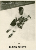
Fitting the status quo of team sets from the decade, this set contains 19 of the Sharks’ top players. Every skater to appear in more than half of the team’s games are included, as are both goaltenders. One noteworthy player in this set is Alton White, the second black man (after Willie O’Ree) to play in major professional hockey.
 Card design 1 out of 5
It’s painful to say the word “design” while discussing these cards. Team issue sets don’t need to re-invent the trading card when it comes to design – and they usually don’t – but there should at least be one nice thing about them.
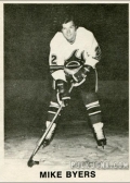
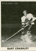
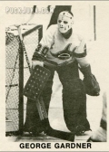
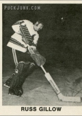
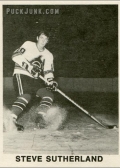
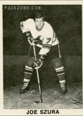
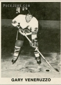
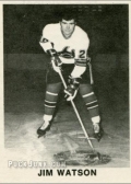
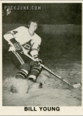
But that is not the case. Instead, here we get a dark, boring, black-and-white photo with the player’s name below. Seventeen of the 19 cards in this set use pictures of the players either facing off or doing a hockey stop. The pictures are so dark that their hair blends with the background. Perhaps the team wanted to save money on the electric bill that day. And for some reason, the players are wearing their white home jerseys but their dark road socks. The other two cards – Alton White and George Gardiner – use game action photos, standing out as the only exciting thing in an otherwise abysmal set.
 At 2 9/16″ x 3 7/16″, these cards are just a touch larger than standard size. However, they may have been cut apart by hand (and not by the printer), as some of the cards vary 1/8″ of an inch in width.
Back Design / Stats & info n/a
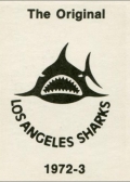
The back of each card is the same – the Sharks’ logo, team name and the text “The Original” at the top and “1972-3” at the bottom. I guess that by eliminating the other “7” in the year, the team cut costs on typesetting.
The Sharks logo on the back of each card might be the best thing about this set. What’s not to love about a pissed-off cartoon Shark making bitey face? That alone almost makes up for the lack of stats.
 Despite being a founding member of the WHA, the Los Angeles Sharks were not a significant team in the annals of hockey. Other than the cartoon shark on the card backs, these bland, forgettable cards are really nothing to look at.
BONUS: The entire set
Below are scans of the entire 1972-73 Los Angeles Sharks team set. WARNING: this is one ugly set. Proceed at your own risk. Click on any one to start the slide show.
NOTES
19 card set
Card size: 2 9/16″ x 3 7/16″
Click here to download a printable checklist

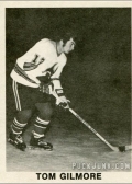
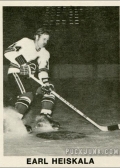
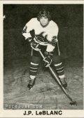
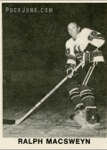
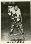
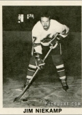

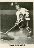
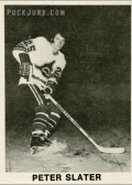


Simple yet affective? Okay maybe not…I'd give it 1.5 though cuz I still like the vintage feel it brings
I suspect this picture set was actually taken in colour, but printed in black & white. I don’t know what the cardset context was (sales, giveaway, etc) but maybe they didn’t think the number justified the expense of colour printing. But this was 70’s LA, not 50’s Fargo. Colour required, especially when your most interesting player comes in B&W already. Kind of camouflages the lead story on a starless team.
If the exact same pictures were in colour..and taken in their WAY cooler blood red uniforms, that alone would have made the set FAR better. But in fairness, the set is rather complete in the way that they included an entire roster worth of players. In terms of hockey card sets of the 70’s & even 80’s, that was rare. Some league sets only included 3 players from weaker teams. Even team-produced sets stopped at 10, or whatever number the printer told them would cost more.
You’re probably right — color photos, but B&W printing. And it is a shame that this set didn’t use their bright red uniforms. Then again, it’s not like full-color trading cards would have saved this team.