
 My girlfriend has been watching Shark Week on The Discovery Channel pretty much nonstop the past week. That, of course, gets me thinking about the San Jose Sharks, and what a cool logo they have.Then I started thinking about some of the other teams that use a shark as their logo. Here’s a look at five of the coolest logos inspired by everyone’s favorite underwater predator.
#1 – Tallahassee Tiger Sharks (ECHL)
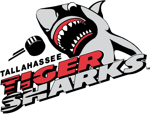 Minor league hockey logos can be goofy at times, with a silly cartoon animal as its mascot. But not this minor league shark, which is ready to strike an unsuspecting puck — or opponent. The pointy, white teeth, blood-red gums and shadow-obscured face make this shark particularly intimidating. And the name “Tiger Sharks” sounds cool because of the alliteration and because a tiger shark is way more bad ass than a nurse shark.
#2 – Cleveland Barons (AHL)
 The minor league Cleveland Barons were affiliated with the San Jose Sharks from 2001 to 2006. Here, the Shark jumps in an arc, making the letter C — much like the killer whale in the Vancouver Canucks logo. This shark is a gentlemen, as he is wearing a monocle, top hat and suit coat with tails. But he’s rolled up his sleeves and is ready to kick some ass. This logo reminds me of the old cartoon Mr. Jaws. Anyone else remember Mr. Jaws?
 #3 – Rimouski Océanic (QMJHL)
 The Océanic logo is also a Rorschach test. Do you see an ocean liner with teeth painted on it, cutting through the waves? Or do you see a Fleur-di-lis? Or do you see an angry shark? I choose to see the third option. In fact, the Océanic logo looks a lot like the Jaws movie poster.

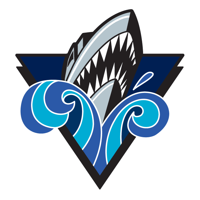
#4 – San Jose Sharks (NHL)
 No roundup of shark-themed hockey logos would be complete without the most famous of them all: the San Jose Sharks. I love the team’s original logo. It is a traditional hockey logo, with flat colors and a triangle in the background — much like the Pittsburgh Penguins logo.

But the newer version of the Sharks logo has grown on me over the past few years. It is more colorful and has an anime look to it.
 #5 – Los Angeles Sharks (WHA)

 The Los Angeles Sharks were a team in the World Hockey Association back in the 1970s. Their logo gets points for being an angry shark making bitey face. It is also very straightforward: no hockey stick, puck, skates or anything else to indicate that they are a hockey team. And that is OK. A logo doesn’t need a stick or puck to be good. A little more color might have helped, though. The Sharks jerseys were red, so maybe adding red eyes — or red blood dripping from its teeth! — would have put this over the top.
BONUS…the worst shark-inspired logo:
Kölner Haie (a.k.a. “Cologne Sharks” of the German Hockey League)
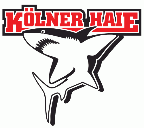 This shark is just sad. Maybe the artist was trying to be avant-garde or something with the logo design. How German! But the squiggly mouth and wide-open eyes makes the shark look like he has to pee really bad, but can’t find a restroom quick enough. Dude, shark…you live in the ocean. Look no further. It’s cool; everyone else does it.
Also making this logo bad is that it reminds me of a different cartoon shark: Jabberjaw.

So, what shark-inspired logos did I miss? If you can think of a great — or awful — shark-themed logo, leave a comment below. ■


After reading this I had to go look through my hockey business card collection. Going through it I didn’t find anything new so I’d have to give your list two thumbs up, and say you nailed it!
A hockey business card collection? You must be connected!
Nice read on this one. Still maintain the Penguin is the much angrier looking – I am obviously biased however 😉
I guess there is something menacing about an angry looking penguin in old style gloves holding a hockey stick lol
Remember that the original penguin was kind of chubby, and not as angry looking. Guess they had to toughen him up a bit.